Tailwind CSS — How to Design Advanced Custom Animations
Background
Animation has become an essential aspect of web design, allowing developers to create captivating and interactive user experiences.
Tailwind CSS, a popular utility-first CSS framework, provides a powerful set of tools that can be leveraged to create stunning animations effortlessly.
In this blog post, we will explore the exciting world of advanced animations using Tailwind CSS and uncover some mind-blowing techniques that will take your web projects to the next level.
Refer to Custom Animations using Tailwind CSS For basic ones.
Sponsored
We believe that everyone deserves the opportunity to succeed and thrive, and Justly is designed to provide the guidance and support needed to make that a reality.
The Power of Transition and Transform
Tailwind CSS provides a range of utility classes that leverage CSS transitions and transforms. These properties allow you to create smooth animations and stunning transformations with minimal effort.
In addition to transitions and transforms, Tailwind CSS also supports keyframe animations. Keyframes allow you to define custom animations by specifying a series of style changes at different points in time.
Let’s delve deep into different types of animations.
1. Animate Gradient Text
To animate the gradient text, we will include the animate-pulse class. This class applies a pulsating animation to the element, giving it a subtle yet eye-catching effect.
Example
<div class="ms-52 my-10 text-5xl font-extrabold">
  <span class="animate-pulse bg-gradient-to-r from-pink-500 via-green-500 to-violet-500 bg-clip-text text-transparent"> Tailwind CSS Animation </span>
</div>
In this example, we have <span> element that contains the text "Gradient Text". To create the gradient effect, we use the text-transparent class to make the text transparent. Finally, we use the bg-gradient-to-r class to specify a horizontal gradient from purple to blue.
We can use this animation to highlight or focus the details.
Check out the live demo in the playground and feel free to play with it as per your requirements.
2. Animate Placeholder Area
In this example, we’ll create a placeholder content area using Tailwind CSS for situations when there is no internet connection or data is being loaded :)
Example
<div class="mx-auto mt-10 w-full max-w-sm rounded-md border border-gray-300 p-4">
  <div class="animate-pulse space-x-4">
    <div class="grid">
      <div class="flex">
        <div class="w-10 rounded-full bg-slate-200"></div>
        <div class="ms-4 w-full space-y-6">
          <div class="h-2 rounded bg-slate-200"></div>
          <div class="space-y-3">
            <div class="grid grid-cols-3 gap-4">
              <div class="col-span-2 h-2 rounded bg-slate-200"></div>
              <div class="col-span-1 h-2 rounded bg-slate-200"></div>
            </div>
            <div class="h-2 rounded bg-slate-200"></div>
          </div>
        </div>
      </div>
      <div class="mt-5 space-y-6 py-1">
        <div class="h-2 rounded bg-slate-200"></div>
        <div class="space-y-3">
          <div class="grid grid-cols-3 gap-4">
            <div class="col-span-2 h-2 rounded bg-slate-200"></div>
            <div class="col-span-1 h-2 rounded bg-slate-200"></div>
          </div>
          <div class="h-2 rounded bg-slate-200"></div>
        </div>
        <div class="h-2 rounded bg-slate-200"></div>
      </div>
    </div>
  </div>
</div>
In this example, we use a nested <div> with the flex class to center the loading text both horizontally and vertically. The justify-center and items-center classes ensure the content is centered within the parent container.
By applying the animate-pulse class, the entire placeholder area will exhibit a pulsating animation, giving the illusion of activity and indicating to the user that content is being loaded.
We can use this animation to show the requested data is being loaded.
Check out the live demo in the playground and feel free to play with it as per your requirements.
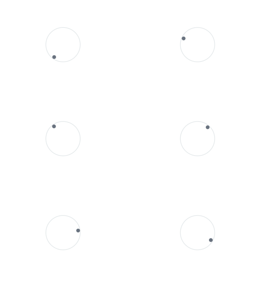
3. Infinitely Rotating Ball
This animation code creates a circular element with a border and an animated spinning effect. Inside the circular element, there is a smaller circular element positioned in the top-right corner.
Example
<div class="my-40 flex">
  <div class="relative mx-auto h-28 w-28 animate-spin rounded-full border-2 p-4">
    <span class="absolute right-5 top-2 flex h-3 w-3">
      <span class="bg-white-500 relative inline-flex h-3 w-3 rounded-full bg-gray-500"> </span>
    </span>
  </div>
</div>
The above code snippet has a div element with the classes my-40 and flex. Inside of this div we can create a circular element with a spinning animation effect infinitely using animate-spin class. We can use it to show the processing of data load or the uploading process of images or files.
Using this animation we can show the processing of data load or image, file uploading.
Check out the live demo in the playground and feel free to play with it as per your requirements.
4. Double Bouncy Circles
This animation code creates an animation with two circles. It consists of a larger circular shape that bounces and a smaller circular shape spinning below it. The animation effects give the illusion of loading or activity.
Example
<div class="my-40 flex">
  <div class="relative mx-auto h-10 w-10 animate-bounce">
    <div class="mx-auto h-16 w-16 animate-pulse rounded-full bg-gray-400"></div>
    <span class="absolute flex h-5 w-5 animate-spin">
      <span class="h-4 w-4 rounded-full bg-gray-400"> </span>
    </span>
  </div>
</div>
In this animation, we have a div with classes for relative positioning, centering, sizing, and a bounce animation effect. Inside the second div, there is another div element with classes for centering, sizing, a pulse animation effect, and gray background color.
We have applied animate-bounce class on the parent div that’s why all the inner elements have a default bouncy effect. We have also, applied animat-pulse effect on a bigger circle for the pulse effect.
We can use this animation to show the user’s activity or data loading effect.
Check out the live demo in the playground and feel free to play with it as per your requirements.
5. Spinning Dotted Square
This animation code consists of a rounded box shape that spins, indicating some kind of activity or loading. The box has a dotted gray outline for added visual effect with animate-spin.
Example
<div class="my-40 flex">
  <div class="mx-auto h-20 w-20 animate-spin rounded-3xl p-6 outline-dotted outline-2 outline-gray-500"></div>
</div>
The above code snippet has animate-spin class that applies a spinning animation effect to the inner div. The rounded-3xl class rounds the corners of the inner div to create a more rounded shape. The outline-dotted, outline-2, and outline-gray-500 classes apply a dotted gray outline with a width of 2 units to the inner div.
We can use this animation in multiple places like highlighting frames, loading data, file or image processing, etc.
Check out the live demo in the playground and feel free to play with it as per your requirements.
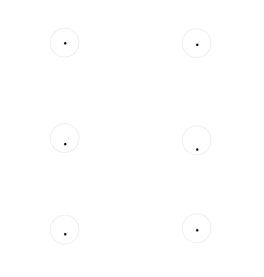
6. Bouncy Circles
This animation code will create a loading animation effect with two bouncing elements. The outermost element will bounce, and within it, there will be a nested element that also bounces.
Additionally, there is a smaller dot-like element that moves and bounces along with the other elements.
Example
<div class="my-40 flex">
  <div class="relative mx-auto h-10 w-10">
    <div class="relative mx-auto ms-5 h-24 w-24 animate-bounce rounded-full border-2">
      <div class="absolute bottom-0 right-10">
        <div class="relative h-40 animate-bounce">
          <div class="absolute bottom-0 right-0 h-2 w-2 rounded-full bg-black"></div>
        </div>
      </div>
    </div>
  </div>
</div>
The outermost div with the class animate-bounce will create a bouncing animation effect.
Inside that div, there is a nested div with the class animate-bounce, which will also create a bouncing effect. Inside the second nested div, with a black background color (bg-black) and a small size of h-2 and w-2. This creates a small black dot or indicator that will also participate in the bouncing animation.
We can use this animation to show file or image processing and loading.
Check out the live demo in the playground and feel free to play with it as per your requirements.
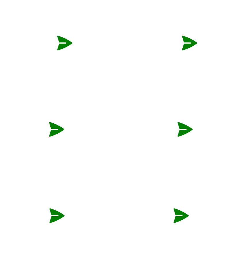
7. Forwarding Arrow
This animation code will create a moving animation effect on the SVG element. The SVG represents a green arrow, and the animation will make the arrow move horizontally back and forth by translating its X position.
Example
<div class="my-40 flex">
  <div class="relative mx-auto mt-5 animate-[propel_5s_infinite]">
    <svg xmlns="http://www.w3.org/2000/svg" viewBox="0 0 24 24" fill="green" class="h-16 w-16">
      <path d="M3.478 2.405a.75.75 0 00-.926.94l2.432 7.905H13.5a.75.75 0 010 1.5H4.984l-2.432 7.905a.75.75 0 00.926.94 60.519 60.519 0 0018.445-8.986.75.75 0 000-1.218A60.517 60.517 0 003.478 2.405z" />
    </svg>
  </div>
</div>
Now, add keyframes in your tailwind.config.js file to animate the object. You can modify it according to your requirements.
tailwind.config.js
module.exports = {
  content: ['./pages/**/*.{js,ts,jsx,tsx}', './components/**/*.{js,ts,jsx,tsx}'],
  theme: {
    extend: {
      keyframes: {
         propel: {
          '0%': { transform: 'translateX(0)' },
          '20%': { transform: 'translateX(25%)' },
          '40%': { transform: 'translateX(-25%)' },
          '60%': { transform: 'translateX(25%)' },
          '100%': { transform: 'translateX(-25%)' },
        },
      },
    },
  },
  plugins: [],
}
The outermost div has the classes my-40 and flex, which provides vertical spacing and enables a flexbox layout. Inside the second div, there is an svg element with attributes for the XML namespace, viewBox, and class. The h-16 and w-16 classes set the height and width of the SVG and fill="green" attribute sets the fill color of the SVG to green.
We can use this animation to guide, focus and highlight areas.
Check out the live demo in the playground and feel free to play with it as per your requirements.
8. Rotating Squares
This animation code will create a container with a rotating animation effect applied to it, making it displace or rotate back and forth continuously.
Inside the container, there is a smaller element that also has a flipping animation effect applied to it, making it rotate vertically back and forth continuously.
Example
<div class="my-40 flex">
  <div class="relative mx-auto h-28 w-28 animate-[displace_5s_infinite] border border-red-200">
    <div class="h-14 animate-[flip_5s_infinite] bg-red-100"></div>
  </div>
</div>
Now, add keyframes in your tailwind.config.js file to animate the object.
tailwind.config.js
module.exports = {
  content: ['./pages/**/*.{js,ts,jsx,tsx}', './components/**/*.{js,ts,jsx,tsx}'],
  theme: {
    extend: {
      keyframes: {
        displace: {
          '0%': { transform: 'rotate(0deg)' },
          '20%': { transform: 'rotate(-90deg)' },
          '40%': { transform: 'rotate(0deg)' },
          '60%': { transform: 'rotate(0deg)' },
          '80%': { transform: 'rotate(90deg)' },
          '100%': { transform: 'rotate(0deg)' },
        },
      },
    },
  },
  plugins: [],
}
The animate-[displace_5s_infinite] class applies the "displace" animation effect to this element, making it rotate back and forth continuously.
Inside the inner div the classes h-14, animate-[flip_5s_infinite], and bg-red-100 represents the content within the container has a height of 14 units, a red background color, and the "flip" animation effect applied to it, making it rotate vertically back and forth continuously.
We can use this animation for loading data and files or image processing or uploading.
Check out the live demo in the playground and feel free to play with it as per your requirements.
Combining Animations with Other Tailwind Features (Dark Mode)
Tailwind CSS’s animation capabilities can be seamlessly integrated with other features provided by the framework. For instance, you can combine animations with responsive design classes to create adaptive and engaging user experiences across various devices.
You can also leverage Tailwind CSS’s dark mode feature to apply different animations based on the user’s preferred color scheme. By utilizing dynamic classes and utility variants, you can create sophisticated and interactive animations that enhance your web design.
Check out the live demo of dark mode in the playground and feel free to play with it as per your requirements.
Conclusion
The above-designed animations showcase the versatility and creativity that can be achieved using CSS and the Tailwind CSS framework. These examples demonstrate various animation effects, such as spinning, bouncing, pulsing, flipping, and wiggling.
By leveraging the power of CSS keyframes and Tailwind CSS utility classes, these animations bring dynamic and engaging elements to a blog or website. Whether it’s rotating icons, bouncing shapes, or wiggling text, these animations can capture the attention of users and enhance the visual experience.
Furthermore, the ability to customize and define keyframes within the Tailwind CSS configuration file allows for fine-tuning and extending the animation capabilities. This flexibility empowers developers to create unique and eye-catching effects tailored to their specific design requirements.
Overall, incorporating animation effects into a blog can help create a memorable and delightful user experience, leaving a lasting impression on visitors. However, it’s important to use animations judiciously and consider their impact on performance and accessibility to ensure a seamless and inclusive browsing experience for all users.
That’s it for today. Keep exploring for the best. 👋
Similar articles

Whether you need...
- *High-performing mobile apps
- *Bulletproof cloud solutions
- *Custom solutions for your business.

